TYPOGRAPHY | TASK 3(A) EXERCISES - TYPE DESIGN AND COMMUNICATION
TYPOGRAPHY | TASK 3(A) EXERCISES - TYPE DESIGN AND COMMUNICATION

17.5.2022 - 31.5.2022 (Week 8 - Week 10)
Er Xin Ru (Melanie) | 0354939
Bachelor Of Design (Hons) In Creative Media | Taylor's University
Subject : GCD60104 - Typography
Task 3(A) | Exercises
- Typeface Font Design
Typo Task 3A Typeface Construction (Shapes)
Task:
1. Research - type design
2. Sketches: Different options (sans serif/serif, uppercase/lowercase)
3. Identify references - from the 10 typefaces: Which of the 10 typefaces comes the closest to your chosen design (sketches).
References & Lecture Playlist

Screenshot 1 - Lecture for S(A) (26/5/2022)

Screenshot 2 - Lecture for 3(B) (26/5/2022)

Fig 1 - Example of Construction (26/5/2022)

Fig 2 - Ascender height & Descender line (26/5/2022)
- Ascender height and Descender line (ascender and descender line must be within 1000pt)
- Baseline (X-height must be 500pt)
- Capital height
- Mean/median line
INSTRUCTIONS
Type Design & Communication : Outline of the assignment
You will be tasked to design a limited number of western alphabets. To begin, choose an existing font design that adheres to the direction that you would like to head in. Study the font carefully by analysing its anatomical parts.
Start with rough sketches and upon approval begin digitization of the drawings—software for digitization shall be determined in class. Artworks shall be printed out for critique sessions followed by refinements. If time permits we shall generate the font for actual use.
You will endeavour to create a typeface that has the hallmarks of a good typeface; subtlety, character, presence, legibility and readability. Below are the letters you will design;
a e t k g r i y m p n ! # , .
Process of Work
1. Idea Sketch

Fig 1 - Sketches (26/5/2022)
Digitalize - Character Design
After sketching, I proceed with the design using Adobe illustrator. Before doing the assignment at this stage of the process, I only had to use the word provided which is (a e t k g r i y m p n ! # , .), so I try to create, trace and shape it similar as my sketches.

Fig 1 - Digitalize with lines 'AETKGRIYMPN!#,.' (26/5/2022)

Fig 2 - Digitalize with Constructions 'AETKGRIYMPN!#,.' (31/5/2022)

Fig 3 - Process of digitalize (MPN!#,.) (31/5/2022)

Fig 4 - Process of digitalize (AETK) (31/5/2022)

Fig 5 - Process of digitalize (KGRIY) (31/5/2022)

Fig 6 - Process of digitalize line view (AETK) (31/5/2022)

Fig 7 - Process of digitalize line view (GRIYM) (31/5/2022)

Fig 7 - Process of digitalize line view (MPN!#,.) (31/5/2022)

Fig 1 - Adjustment and Ascender for font (31/5/2022)
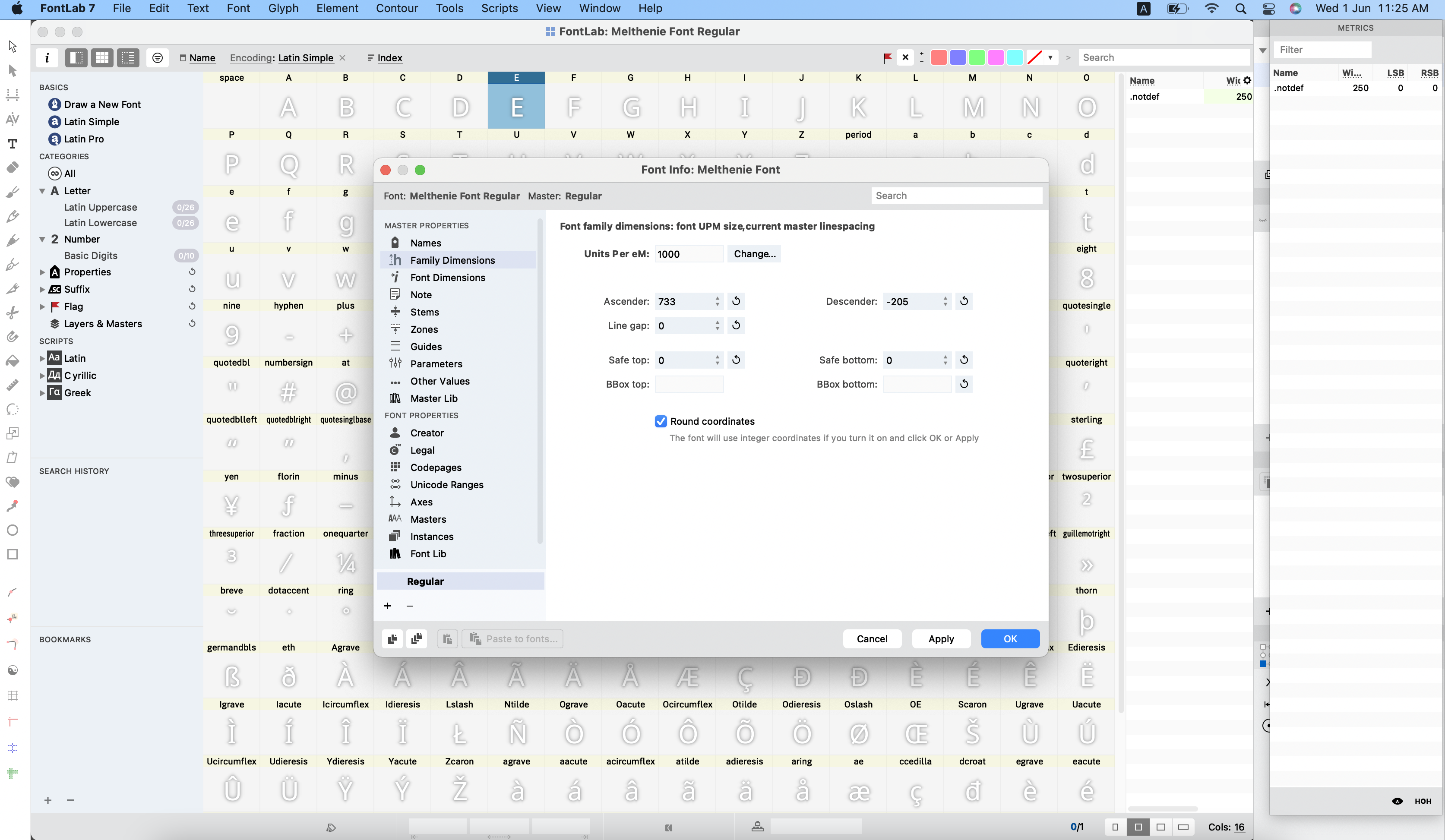
Fig 2 - Adjustment and Ascender for font (31/5/2022)

Fig 3 - Paste my font from illustrator to FontLab (31/5/2022)

Fig 4 - Kerning in FontLab 1 (31/5/2022)
Vid 5 - Kerning in FontLab 2 (31/5/2022)

Fig 6 - Kerning in FontLab 3 'AETKGRIYMPN!#,.' (31/5/2022)
Vid 1 - Type out my font in Adobe illustrator (31/5/2022)

Fig 2 - Type out my font in Adobe illustrator 'AETKGRIYMPN!#,.'
(31/5/2022)

Fig 2 - Download my font named _Feel my rhythm in file Open TT
(31/5/2022)

Fig 3 - Open TT in Font Book
'AETKGRIYMPN!#,.'
(31/5/2022)• Illustrator all letters on baseline export: 300dpi; JPG; Grayscale (max width 2048 pixels)
• Poster export: A4; Grayscale; JPG; 300dpi (credit line, 8pt Univers)
• Poster Save as: A4; PDF (credit line, 8pt Univers)

Fig 1 - Poster with my Typefaces (5/6/2022)

Fig 2 - 8pt, Univers font (5/6/2022)
FINAL OUTCOME

Fig 1- Final outcome 'AETKGRIYMPN!#,.'
Week 10 (31/2/2022).Specified Fonts JPEG with Guide Lines (5/6/2022)

Fig 2 - Final outcome 'AETKGRIYMPN!#,.' Specified Fonts JPEG (5/6/2022)
Fig 3 - Final outcome 'AETKGRIYMPN!#,.' Specified Fonts PDF (5/6/2022)
'_Feel my Rhythm' Font Download link:

Final '_Feel my Rhythm' Font Outcome Poster JPEG (5/6/2022)
Final '_Feel my Rhythm' FontOutcome Poster PDF (5/6/2022)
Week 9 :
General feedback: I done a lot of research on how to create a Typeface/Font & also there are lots of beautiful Typeface I like it a lot. But for my ideal concept is Classic, Elegant and also have Cursive feels. I sketch total 6 of the Typeface design but Mr.Vinod suggest me to take design #4, as i like design #4 too.
Specific feedback: I like the Typeface design #1 & #4. Mr.Vinod approve the Idea #4 and I also decided to proceed and go with idea #4.
Week 10 :
General feedback: Mr.Vinod say the digitalize typeface design look nice & good. But there are places need to be change is the line is too thin that when the font size is small, it can't see clearly and it's a waste since the Typeface/Font is very nice.
Specific feedback: The line can be add thicker as it can see when the font size is small.
Experiences
It was a very difficult task for me as I meet a lot of problems when starting and end of the task. It was the first time for me to create a Typeface/Font and also Generate the Font in FontLab. I keep repeating lectures video and try to do it the best as I can. Even it is difficult but I feel excited to learn new things.
Observation
Although we only created the Alphabet and Sign that are given but I think I learn a lot through the whole 3 weeks. Because it was little so I can more focus on creating my fonts, and also done my research to do it more perfectly as I can. I know there are more improvement can be made, but I have done my best.
Findings
In the process of designing fonts, I noticed that each details is very important as tiny ratio of the vertical & horizontal line, size and widths will change everything. I used a lot of time changing the small tiny changes to make it more perfectly. After download the font, I try to type it at Adobe Illustrator and it comes out greatly. I also design the poster with research and also the word given "make type great again!"
FURTHER READING
Week 9:
Freehand: New Typography SketchbooksAuthor: Steven Heller, Lita Talarico

Fig 1 - Typography Sketchbook
Freehand: New Typography Sketchbooks
Page through the personal sketchbooks of the most influential and inventive illustrators and typographers working today. This rich compendium of typographic ideas stresses the importance of typographic thinking at a time when reading habits are evolving, while celebrating the varied and innovative ways that designers practice this time-honored craft.
Week 10 :
Designing TypeAuthor: Karen Cheng

Fig 2 - Designing Type
In this book, Karen Cheng explains the processes behind creating and designing type, one of the most important tools of graphic design. She addresses issues of structure, optical compensation, and legibility, with special emphasis given to the often-overlooked relationships between letters and shapes in font design. Illustrated with more than 400 diagrams that demonstrate visual principles and letter construction, ranging from informal progress sketches to final type designs and diagrams, this essential guide analyzes a wide range of classic and modern typefaces, including those from many premier type foundries.


Comments
Post a Comment