TYPOGRAPHY TASK 1 | TYPE EXPRESSION & TYPE FORMATTING
29.3.2022 - 28.6.2022 (Week 1 - Week 14)
Er Xin Ru (Melanie) | 0354939
Bachelor Of Design (Hons) In Creative Media | Taylor's University
Subject : GCD60104 - Typography
Task 1 | Exercises
- Type Expression
- Formatting Text
LECTURES
Week 1 | Introduction & Briefing - 29.3.2022
Week 1 lecture was mainly an explanation of details that what we will learn in the module. Firstly, Mr. Vinod focused on taking us through the Typography Facebook group & Times to show us where the important announcement and useful learning materials are.
All the information, contents and submission is all well-organized. For practical, Mr. Vinod told us to set up a blog called "e-Portfolio". This blog will be used to accumulate the learning process of all modules, and it will be utilized to submit assignments including image data of my work, drawings, photos, designs, etc. After that, we were told to download 10 typefaces and choose our own 4 words, given by Mr. Vinod for Task 1 (Type Expression).
Week 2 | The Evolution of Typography - 5.4.2022
In week 2, Mr. Vinod looked through each of our design works and gave us feedback. We need to digitalize our typography into Adobe Illustrator, and a short tutorial on how we could do it.
For Exercise 1, we are given a set of words to pick from, which are then to be used to create type expressions. Those words are Cough, Explode, Pop, Wink, Grow and Squeeze. We are only able to use the colors of black and white. There are only 10 typefaces that are allowed throughout this entire process
1. Adobe Caslon Pro
2. Bembo Std
3. Bodoni Std
4. Futura Std
5. Gill Sans Std
6. ITC Garamond Std
7. ITC New Baskerville Std
8. Janson Text LT Std
9. Serifa Std
10. Univers LT.
I choose 4 words from a list of word prompts prepared by Mr. Vinod. "Cough" is (Mandatory), the next one is the words "Explode", "Pop" and "Squeeze" for the other 3 words. I use my creativity and design the word prompts in a way the meaning of the words is expressed. But in the end, the hand-drawn Typography must be converted into the fonts given by Mr. Novid in digital.
Week 3 | Typography illustration - 12.4.2022
In Week 3, we began our type expression short animated gifs (GIFs) for our chosen word, by using software such as Adobe Illustrator and Adobe Photoshop to perform the process of animating the word into its main form of expression.
Week 4 | Text Formatting - 19.4.2022
Week 4 is where we begin with the next task, known to be ‘Text Formatting’. Based on the lecture video(s), Kerning adjusts the space between individual letterforms. Tracking, also known as 'letter-spacing', adjusts spacing uniformly over a range of characters. To carry this out, we will be utilizing the 10 typefaces which have been provided by our lecturer.
LECTURE STUDY
All the notes are recorded on youtube. When listening to the lectures take notes, this will keep you focused. Complete the lecture series by week 5. There are also "how-to" recordings for the various tasks, these will be referred to you when we begin those tasks.
1. Typo 1 | Development
2. Typo 2 | Basic
3. Typo 3 & 4 | Text part 1 & 2
4. Typo 5 | Understanding
5. Typo 6 | Screen & Print
6. Typo Ex | Type Expression Words 1&2
7. Typo Ex | Type Expression Animation - Basic
8. Typo Ex | Formationg 1:4, 2:4, 3:4, 4:4, 4.4A
https://www.youtube.com/playlist?list=PLZk01iRkmnlUF8tRLTTAogutYcraV6DFR
Week 2 | The Evolution of Typography (29.3.2022/5.4.2022)
Typo 1 - Development & Timeline
Typography Introduction
Figure 1.0 What is Typography? (29/3/2022)
Typography is the technique of organizing a message in a comprehensible and aesthetically beautiful arrangement. it's an important part of the design. There are five basic classifications of typefaces which is; serif, sans serif, script, monospaced, and display. Since the introduction of computers, the world of typography has changed forever. The computer allows thousand of beautiful typefaces even the odd one, and anyone has the freedom to create their own typefaces.
1. Typography - Development / Timeline
Early letterform development: Phoenician to Roman - Initially writing meant scratching into wet clay with a sharpened stick or carving into stone with a chisel. The forms of uppercase letterforms
(for nearly 2000 years the only letterforms) can be seen to have evolved out of these tools and materials.
At their core, uppercase forms are a simple combination of straight lines and pieces of circles, as the materials and tools of early writing required.
Caption:
Right: 4th century B.C.E. Phoenicians votive stele Carthage, Tunisia stele bears a four-line inscription to Tanit and Baal Hammon.
Left: Evolution from the Phoenician letter.
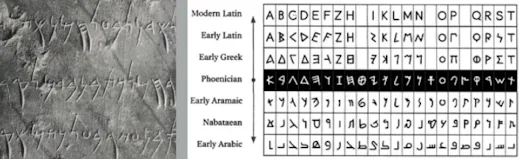
Figure 1.1 Evolution from the Phoenician letter 29/3/2022
Early letterform development: Phoenician to Roman
The Greeks changed the direction of writing. Phoenicians, like other Semitic peoples, wrote from right to left. The Greeks developed a style of writing calle' boustrophedon' (how the ox plows), which meant
that the lines of text read alternately from right to left and left to right.
As they change the direction of reading they also changed the orientation of the letterforms:
Caption:
Greek like the Phoenicians, did not use letter space or punctuations. Latter or the Greeks would move to a strictly left-to-right writing
Figure 1.2 Uppercase Letterform Development (29/3/2022)
Early letterform development: Phoenician to Roman
Etruscan (and then Roman) carvers working in marble painted letterforms before inscribing them. Certain qualities of their stroke a change in weight from vertical to horizontal, a broadening of the stroke at start and finish- carried over into the carved letterforms.
Figure 1.3 Late 1st century B.C.E., Augustan inscription in the Roman
Forum, Rome (29/3/2022)
Early letterform development: Phoenician to Roman
Figure 1.4 Phoenician, Greek and Roman (29/3/2022)
2. Hand Script from 3rd - 10th century C.E
Figure 2 - 4th or 5th century: Square Capitals (29/3/2022)
Square Capitals: Square capitals were the written version that can be found in Roman monuments. These letterforms have serifs added to the finish of the main strokes. The variety of stroke width was achieved by the reed pen held at an angle of approximately 60° off the perpendicular.
Figure 2.1 - Late 3rd - mid 4th century: Rustic capitals (29/3/2022)
Rustic Capitals: A compressed version of square capitals, rustic capitals allowed for twice as many words on a sheet of parchment and took far less time to write. The pen or brush was held at an angle of approximately 30° off the perpendicular. Although rustic capitals were faster and easier to, they were slightly harder to read due to their compressed nature
Figure 2.2 - 4th century: Roman cursive (29/3/2022)
Roman Cursive: Both square and rustic capitals were typically reserved for documents of some intended performance. Everyday transactions, however were typically written in cursive hand in which forms were simplified for speed. We can see here the beginning of what we refe to as lowercase letterforms
Figure 2.3 - 4th - 5th century: Uncials (29/3/2022)
Uncials: incorporated some aspects of the Roman cursive hand especially in the shape of the A, D, E, H, M, U, and Q. 'Uncia' is Latin for a twelfth of anything; as a result, some scholars think that uncials refer to letters that are one inch (one-twelfth of the foot) high. It might, however, be more accurate to think of uncials simply as small letters. The broad forms of uncials are more readable at small sizes than rustic capitals.
Figure 2.4 - C. 500: Half Uncials (29/3/2022)
Half Uncials: A further formalization of the cursive hand, half-uncials mark the formal beginning of lowercase letterforms, replete with ascenders and descenders, 2000 years after the origin of the Phoenician alphabet.
Figure 2.5 - C. 925 : Caroline miniscule (29/3/2022)
Charlemagne: Charlemagne, the first unifier of Europe since the Romans, issued an it in 789 to standardize all ecclesiastical texts. He entrusted this k to Alcuin of York, Abbot of St Martin of Tours. The monks rewrote › texts using both majuscules (uppercase), minuscule, capitalization d punctuation which set the standard for calligraphy for a century.
3. Blackletter to Gutenberg's type
Figure 3 -C. 1300: Blackletter (Textura) (29/3/2022)
Blackletter to Gutenberg's: type With the dissolution of Charlemagne's empire came regional variations upon Alcuin's script. In northern Europe, a condensed strongly vertical letterform known as Blackletter or textura gained popularity. In the south, a rounder more open hand gained popularity called 'rotunda'. The humanistic script in Italy is based on Alcuin's minuscule
Figure 3.1-c. 1455; 42 line bible, Johann Gutenberg, Mainz (29/3/2022)
Blackletter to Gutenberg's type Gutenberg's skills included engineering, metalsmithing, and chemistry. He marshaled them all to build pages that accurately mimicked the work of the scribe's hand - Blackletter of northern Europe. His type mold required a different brass matrix, or negative impression, for each letterform
4. Humanist script to roman type
Figure 4- Humanist script to roman type (5/4/2022)
Humanist script to roman type
c. 1460: Lucius Lactantius, Venice.
- 1472: Cardinal Joannes Bessarion, Conrad Sweynheym and Arnold Pannartz, Subiaco press, Rome.
- 1471: Quintillian, Nicholas Jenson, Venice.
Venetian type from 1500
- 1499: Colona, type by Farncesco Griffo
- 1515: Lucretius, type by Francesco Grifo
The Golden Age of French printing
- 1531: Illustrissimae Galliaru reginae Helianorae, printed by Robert Estianne, Paris. Type-cast by Claude Garamond
Dutch printing, c. 1600
- 1572: Polygot Bible (Preface). Printed by Christophe Plantin,Antwerp English type from the eighteen century
- 1734: William Caslon. Type specimen sheet, London
Baskerville' innovations
- 1761: William Congreve, typeset and printed by John Baskerville,Birmingham.
- 1818 Giambatista Bodoni, Manuale Tipografico, Parma.
19th-century types > The first square serifs > Early twentieth-century sans serif (1923 Bauhaus, Moholy-Nagy, 1959 Muller-Brockman)
5. Text type classification (Dates of origin approximated to the nearest quarter-century)
Figure 5 - 1450 Balckletter (5/4/2022)
1450 Blackletter
The earliest printing type, its forms were based upon the hand-copying styles that were then used for books in northern Europe.
Examples: Cloister Black • Goudy Text
Figure 5.1 - 1475 Oldstyle (5/4/2022)
1475 Oldstyle
Based upon the lowercase forms used by Italian humanist scholars for book copying (themselves based upon the ninth-century Caroline minuscule) and the uppercase letterforms found inscribed on Roman
ruins, the forms evolved away from their calligraphic origins over 200 years, as they migrated across Europe, from Italy to England.
Examples: Bembo • Caslon • Dante • Garamond • Janson • Jenson • Palatino
Figure 5.2- 1500 Italic (5/4/2022)
1500 Italic
Echoing contemporary Italian handwriting, the first italics were condensed and close-set, allowing more words per page. Although originally considered their own class of type, italics were soon cast to complement roman forms. Since the sixteenth century, virtually all text typefaces have been designed with accompanying italic forms.
Figure 5.3- 1750 Transitional (5/4/2022)
1750 Transitional
A refinement of old-style forms, this style was achieved in part because of advances in casting and printing. Thick to thin relationships were exaggerated, and brackets were lightened
Examples: Baskerville • Bulmer • Century • Time Roman
Figure 5.4- 1775 Modern (5/4/2022)
1775 Modern
This style represents a further rationalization of oldstyle
letterforms. Serifs were unbracketed, and the contrast between thick and thin strokes extreme. English versions (like Bell) are also known as Scotch Romans and more closely resemble transitional forms
Examples: Bell • Bodoni • Caledonia • Didot • Walbaum
Figure 5.45- 1900 Sans Serif (5/4/2022)
1900 Sans Serif
As their name implies, these typefaces eliminated serifs altogether. Although the forms were first introduced by William Caslon IV in 1816. its use did not become widespread until the beginning of the twentieth century. Variation tended toward either humanist forms (Gill
Sans) or rigidly geometric (Futura). Occasionally, strokes
were flared to suggest the calligraphic origins of the form (Optima). Sans serif is also referred to as grotesque (from the German word Grotesk) and Gothic.
Examples: Akzidenz Grotesk • Grotesk • Gill Sans • Franklin Gothic • Frutiger • Futura • Helvetica • Meta • News Gothic • Optima • Syntax• Trade Gothic • Univers
Week 3 | Typography illustration (12.4.2022)
Typo 2 - Basic | Typography: Basic / Describing letterforms
1. Describing Letterforms:As with any craft that has evolved over 500 years, typography employs a number of technical terms. These mostly describe specific parts of the letterforms. It is a good idea to familiarize yourself with the lexicon
Knowing a letterform's component parts make it much easier to identify specific typefaces.
Figure 1 Type of Letterforms 12/4/2022
Figure 1 Baseline (12/4/2022)
- Baseline The imaginary line the visual base of the letterforms.
- Median The imaginary line defining the x-height of letterforms.
- X-height The height in any typeface of the lowercase 'x'
Figure 1.1 Stroke (12/4/2022)
- Stroke: Stroke Any line that defines the basic letterform
Figure 1.2 Apex/Vertex (12/4/2022)
- Apex / Vertex:
The point is created by joining two diagonal stems (apex above and vertex below)
Figure 1.3 Arm (12/4/2022)
- Arm:
strokes off the stem of the letterform, either horizontal (E,F. L) or inclined upward (K, Y).
Figure 1.4 Ascender (12/4/2022)
- Ascender: the portion of the stem of a lowercase letter that overshoots the median. (b,d,h,k)
Figure 1.5 Barb (12/4/2022)
- Barb: the half-serif finish on some curved stroke.
Figure 1.6 Bowl (12/4/2022)
- Bowl: the rounded form that describes a counter (either open/ closed)
Figure 1.7 Bracket (12/4/2022)
- Bracket: the transition between the serif and the stem.
Figure 1.8 Cross Sroke (12/4/2022)
- Cross stroke: the horizontal line in 'f' and 't'.
Figure 1.9 Croth (12/4/2022)
- Crotch: the interior space where two strokes meet. (k, v)
Figure 1.10 Ear (12/4/2022)
- Ear: the stroke extending from the main body. (g, r)
Figure 1.11 Ligature (12/4/2022)
- Ligature: Character formed by the combination of two or more letterforms
Figure 1.12 Stress (12/4/2022)
- Stress: Orientation of the letterform, indicated by the thin stroke in round forms.
Figure 1.13 Swash (12/4/2022)
- Swash: The flourish that extends the stroke of the letterfor
Figure 1.14 Terminal (12/4/2022)
- Terminal: The self-contained finish of a stroke without a serif. This is something of a catch-all term. Terminals may be flat ('T' above), flared, acute, (to above), grave, concave, convex, or rounded like a ball or a teardrop (see finial).
Others- Barb: the half-serif finish on some curved stroke.
- Bowl: the rounded form that describes a counter (either open/ closed)
- Cross Bar: the horizontal stroke in a letterform that joins two stems together.
- Cross stroke: the horizontal line in 'f' and 't'.
- Crotch: the interior space where two strokes meet. (k, v)
- Ear: the stroke extending from the main body. (g, r)
- Descender: Portion of the stem of a lowercase that projects below the baseline
- Em: Distance equal to the size of the typeface
- En: Half the size of an em
- Ligature: Character formed by the combination of two or more letterforms
- Loop: Bowl created in the descender of the lowercase "g"
- Spine: Curved stem of the "s"
- Swash: The flourish that extends the stroke of the letterform
2. Typo 2 - Basic: Typography: Basic / The font
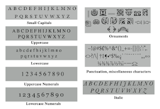
Figure 2 Basic/ The font (12/4/2022)
Figure 2.0 Uppercase (12/4/2022)
Uppercase Capital letters, including certain accented vowels, the cedilla and n tilde, and the a/e and o/e ligatures
Figure 2.1 Lowercase (12/4/2022)
Lowercase Lowercase letters include the same characters as uppercase
Figure 2.2 Small Capitals (12/4/2022)
Small Capitals Uppercase letterforms draw to the x-height of the typeface. Small Caps are primarily found in serif fonts as part of what is often called an expert set.
Most type of software includes a style command that generates a small cap based on uppercase forms. Do not confuse real small caps with those artificially generated.
Figure 2.3 Uppercase Numerals (12/4/2022)
Uppercase Numerals
Also called lining figures, these numerals are the same height as uppercase letters and are all set to the same kerning width. They are most successfully used with tabular material or in any situation that calls for uppercase letters
Figure 2.4 Uppercase Numerals (12/4/2022)
Lowercase Numerals
Also known as old-style figures or text figures, these numerals are set to x-height with ascenders and descenders. They are best used whenever you would use upper and lowercase letterforms. Lowercase numerals are far less common in sans serif
type-faces than in serif.
Figure 2.5 Punctuation, miscellaneous characters (12/4/2022)
Punctuation, miscellaneous characters
Although all fonts contain standard punctuation marks, miscellaneous characters can change from typeface to typeface. It's important to be acquainted with all the
characters available in a typeface before you choose the appropriate type for a particular job.
Figure 2.6 Ornaments (12/4/2022)
Ornaments
Used as flourishes in invitations or certificates. They usually are provided as a font in a larger typeface family. Only a few traditional or classical typefaces contain ornamental fonts as part of the entire typeface family (Adobe Caslon Pro).
Figure 3 Describing typefaces (12/4/2022)
The 10 typefaces mentioned in the following slide represent 500 years of type design. The men and women who rendered them all sought to achieve two goals: easy readability and an appropriate expression of contemporary esthetics.
These typefaces (and there are others) have surpassed the latter goal. They have remained in use for decades - in some cases, centuries - after they were first designed, still considered successful expressions of how we think, how we read and write, and how we print.
As a beginning typographer, you should study these ten faces carefully. For almost any early projects in your dèsign program, these are what you will need to develop your skills. Once you understand how to use these faces appropriately and effectively, you'll be well prepared to understand and appreciate other typefaces as you encounter them.
- Roman: the uppercase forms are derived from inscriptions of Roman monuments. A slightly lighter stroke in roman is known as ‘Book’.
- Italic: Named for fifteenth-century Italian handwriting on which the forms are based. Oblique conversely is based on the roman form of the typeface
- Boldface: Characterized by a thicker stroke than a roman form. Depending upon the relative stroke widths within the typeface, it can also be called ‘semibold’, ‘medium’, ‘black’, ‘extra bold’, or super. In some typefaces (notably Bodoni), the boldest rendition of the typeface is referred to as ‘Poster’.
- Light: A lighter stroke than the roman form. Even lighter strokes are called ‘thin’
- Condense: A version of the roman forum, and extremely condense styles are often called ‘compressed’.
- Extended: An extended variation of a roman font.
Week 4 | Text Formatting (19.4.2022)
Typo 3 - Text P1
1. Typography: Text / Tracking: Kerning and Letterspacing
Normal tracking, loose tracking, and tight tracking.
Figure 1 Differences between with or without kerning;
Differences between normal, loose, tight tracking (19/4/2022)
- Tracking: is the typographer's term for letter-spacing
- Kerning: adjusts the space between individual letterforms to correct visually uneven spacing.
- Letterspacing: refers to the overall spacing of a word or block of text affecting its overall density and texture.

 Figure 1.2 Differences between with or without kerning;
 Differences between normal, loose, tight tracking (19/4/2022)
Formatting Text
Figure 1.3 Flush Left (19/4/2022)
Flush left:
This format most closely mirrors the asymmetrical experience of handwriting. Each line starts at the same point but ends wherever the last word on the line ends. Spaces between words are consistent throughout the text, allowing the type to create an even gray value,
Figure 1.4 Centered (19/4/2022)
Centered:
This format imposes symmetry upon the text, assigning
equal value and weight to both ends of any line. It transforms fields of text into shapes, thereby adding a pictorial quality to the material that is non-pictorial by nature. Because centered type creates such a strongshape on the page, it's important to amend line breaks so that the text does not appear too jagged.
Figure 1.5 Flush Right (19/4/2022)
Flush Right:
This format places emphasis on the end of a line as opposed to its start. It can be useful in situations (like captions) where the relationship between text and image might be ambiguous without a strong orientation to the right.
Figure 1.6 Justified (19/4/2022)
Justified:
Like centering, this format imposes an asymmetrical shape on the text. It is achieved by expanding or reducing spaces between words and, sometimes, between letters. The resulting openness of
lines can occasionally produce rivers' of white space running vertically through the text. Careful attention to line breaks and hyphenation is required to amend this problem whenever possible.
Texture
- Different typefaces suit different messages
- A good typographer needs to know which typefaces suit the best
- Sensitivity in color is essential in creating successful layouts
Figure 1.7 Different Sample of typefaces (19/4/2022)
Figure 1.8 Different Sample of typefaces (19/4/2022)
Leading and line length
- Type size: should be large enough to be read easily
- Leading: Too tight - readers loose place / Too loose - striped patterns cause distractions
- Line length: Shorter lines require less reading; longer lines more (keep between 35-65 characters)
Figure 1.7 Sample of leading & line length (19/4/2022)
InDesign Notes:
Facing pages = Typically for books
Ctrl+Shift+Bigger than or Ctrl+Shift+Alt = Increases the size of word
Ctrl+ = Turn off margin & columns
Alt+< / Edit>Preferences = Kerning
Alt+> = Increase spacing
Typo 4 - Text P2 (19.4.2022)
1. Typography: Text / Indicating Paragraphs
Type Specimen Book
- A type of specimen book is to provide an accurate reference for type, type size, type leading, type line length, etc.
- The text should create a field that can occupy a page or a screen (compositional requirement)
Figure 1 Sample Type Specimen Sheet (19/4/2022)
Figure 1.1 line space vs leading (19/4/2022)
2. Typography: Text / Widow and Orphans
In traditional typesetting (the kind that still endures among conscientious commercial publishers), there are two unpardonable gaffes--widows and orphans. Designers (specifically those that deal with large amounts of text in websites or books on online magazines or printed magazines, newspapers, or online journals) must take great care to avoid the occurrence of the above-mentioned.
A widow is a short line of the type left alone at the end of a column of text.
An orphan is a short line of the type left alone at the start of a new column
Figure 2 Widow/ Orphan (19/4/2022)
Figure 2.1 Text / Highlighting Text (19/4/2022)
Typography : Text / Highlighting Text
In this example, the sans serif font (Univers) has been reduced to match the x-height of the serif typeface. 8 ÷ 7.5
Figure 2.2 Text / Highlighting Text (19/4/2022)
Typography: Text / Highlighting Text
I reduce aligned figures (numbers) or All Capital acronym is embedded in the text by .5 as well, to ensure visual cohesion of the text.
Figure 2.3 Quotation (19/4/2022)
Quotation marks, like bullets, can create a clear indent, breaking the oft reading axis. Compare the indented quote at the top with the tended quote at the bottom.
Figure 2.4 Head Indicates (19/4/2022)
A head indicates a clear break between the topics within a section. In the following examples, 'A' heads are set larger than the text, in small caps and in bold. The fourth example shows an Ahead 'extended' to the left of the text.
Typo 5 - Understanding (26.4.2022)
1. Typography: Letters / Understanding letterforms
Figure 1 Uppercase Letterform (26/4/2022)
The uppercase letterforms below suggest symmetry, but in fact, it is not symmetrical. It is easy to see the two different stroke weights of the Baskerville stroke form (below); more noteworthy is the fact that each bracket connecting the serif to the stem has a unique arc.
Figure 1.1 demonstrated lowercase 'a" (26/4/2022)
The complexity of each individual letterform is neatly demonstrated/by examining the lowercase 'a' of two seemingly similar sans-serif prefaces-Helvetica and Univers. A comparison of how the stems of e letterforms finish and how the bowls meet the stems quickly veals the palpable difference in character between the two.
2. Typography: Letters / Maintaining x-height
Figure 2 x-height of razors (26/4/2022)
As you already know, the x-height generally describes the size of the lowercase letterforms. However, you should keep in mind that curved strokes, such as in's', must rise above the median (or sink below the baseline) in order to appear to be the same size as the vertical and horizontal strokes they adjoin.
3. Typography: Letters / Form / Counterform
Figure 3 Counterform (26/4/2022)
Just as important as recognizing specific letterforms is developing a sensitivity to the counter form (or counter)
- the space describes, and often contained, by the strokes of the form. When letters are joined to form words, the counter form includes the spaces between them. The latter is a particular and important concept when working with letterforms like lowercase 'r' that have no counters per se. How well you handle the counters when you set type determines how well words hang together- in other words, how easily we can read what's been set.
Figure 3.1 Counter of the letter (26/4/2022)
One of the most rewarding ways to understand the form and counter of a letter is to examine them in close detail. The examinations also provide a good feel for how the balance between form and counter is achieved and a palpable sense of letterform's unique characteristics. It also gives you a glimpse into the process of letter-making.
4. Typography: Letters / Contrast
Figure 4 Basic Principle of Graphic Design (26/4/2022)
The basic principles of Graphic Design apply directly to typography. The following are some examples of contrast--the most powerful dynamic in design- as applied to the type, based on a format devised by
Rudi Ruegg.
The simple contrasts produce numerous variations: small+organic/large+machined; small+dark/ large light
- THE END OF LECTURES -
INSTRUCTIONS
TASK 1 | EXERCISE 1 - Type Expression
For Exercise 1, we are given a set of words to pick from Typography (TDS) FB Group
Which are then to be used to create type expressions. Those words are Cough, Explode, Pop, Wink, Grow and Squeeze. We are only able to use the colours black and white.
There are only 10 typefaces that are allowed throughout this entire process, that are
1. Adobe Caslon Pro
2. Bembo Std
3. Bodoni Std
4. Futura Std
5. Gill Sans Std
6. ITC Garamond Std
7. ITC New Baskerville Std
8. Janson Text LT Std
9. Serifa Std
10. Univers LT.
1. Sketches
Choose 4 words from a list of word prompts prepared by Mr.Vinod. "Cough" is mandatory, and I choose the word "Explode", "Pop" and "Squeeze" for the other 3 words. I use my creativity and design the word prompts in a way the meaning of the words is expressed.
1. Cough ( Mandatory ) - Bottom Left
2. Squeeze - Bottom Right
3. Explode - Upper Left
4. Pop - Upper Right
Figure 1, Sketches of "Explode", "Pop" - (4/4/2022)
Figure 2, Sketches of "Cough", Squeeze" - (4/4/2022)
2. Digitalizing Texts (no animation)
Feedback on the class from Mr. Vinod, I re-design the Sketches for "Explode", "Pop", "Cough", and "Squeeze" 4 words again. Yet, I converted the New Sketches hand-drawn conversion into digital using Adobe Illustrator and the Fonts provided.
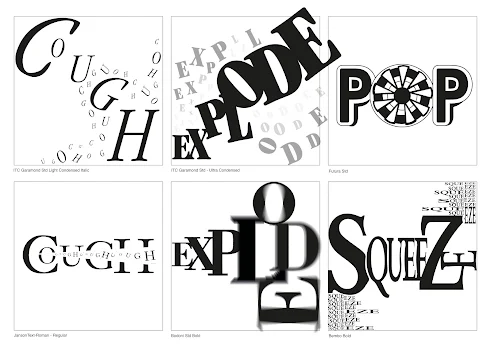 |
Figure 3, Digitized Version New Sketches of
"Explode", "Pop", "Cough", Squeeze" 4 words (12/4/2022)
|
3. Digitalizing Texts (no animation) - Changes for ''Pop" and "Squeeze" DesignFeedback on the class from Mr. Vinod, I re-design the Sketches for "Pop" and "Squeeze" to simplify the design (not too many designs of the word)
Figure 3.1, Changes Digitized Version New Sketches of
"Explode", "Pop", "Cough", Squeeze" 4 words (12/4/2022)
4. Final 4 Digitalize Version Figure 4, Final Digitized Version New Sketches of
"Explode", "Pop", "Cough", Squeeze" 4 words - In Picture (12/4/2022)
Figure 4.1, Final Digitized Version New Sketches of
"Explode", "Pop", "Cough", Squeeze" 4 words (12/4/2022)
5. Animating Texts ( Starting my Animation)In figure 5, I choose the word "COUGH"
as my animated GIF (12/4/2022)
We were instructed to choose the most ideal design & animate one of our type expressions above. With the approval from Mr. Vinod, I choose the word "Cough" as Mr. Vinod said it was a good design, and also I like the Cough word design so much.
I decided to pick this gif as my final one as it looks the most eye-catching and creative one among the rest, it also has a good flow and consists of a lot of panels and layers to create this outcome.
Fig 5.1 Ai Progress, Week 3 (12/04/2022)
-Total used 69 Artboard-
After confirming the word I choose for my Animation, I start creating the artboard with Adobe Illustrator to the movement and feeling I want to present it like coughing in real life. ( Inside Cough is the bacteria from mouth - Outside words of the Big word is our mouth ) Creating gif animations by using Adobe Photoshop / Illustrator. I created the middle frame in Illustrator, after that, I exported the image (Total used 69 Artboard) and imported it into Photoshop.
Fig 5.2 Ps GIF Progress, Week 3 (12/04/2022) - Picture 1
Fig 5.3 Ps GIF Progress, Week 3 (12/04/2022) - Picture 29
Fig 5.4 Ps GIF Progress, Week 3 (12/04/2022) - Picture 38
Fig 5.5 Ps GIF Progress, Week 3 (12/04/2022) - Picture 69
(I use 69 artboards to complete the Final GIF)
6. Final GIF
Fig 6, Final Animation GIF, Week 3 (12/04/2022)
Overall for the Design Concept
- Big Cough means when we cough we have the movement of vibration & trembling ( it represents our "Mouth")
- In the Middle, the cough is coming out which represents there are bacteria, saliva or etc that will cough out when we coughing
TASK 1 | EXERCISE 2 - Type Formatting
Lecture 1:4 - Text Formatting: Kerning and Tracking
For exercise 2 which is text formatting, we were given the task to create a cohesive final layout that addressed a variety of texting formatting issues, including kerning, letter spacing, alignment, leading, and paragraph spacing.
Fig 1-1:4 Text Formatting with Kerning & Tracking Progress (24/4/2022)
Fig 2-1:4 Text Formatting without Kerning (24/4/2022)
Fig 3-1:4 Text Formatting with Kerning & Tracking (24/4/2022)
Fig 4-1:4 differences with and without kerning (24/4/2022)
Using the 10 typefaces that were given to us, I adjusted the kerning and tracking of each text when it is needed. For example fig 3.3, the spacing of each letter seemed too close to each other so I added more space to ensure that readability is better.
Lecture 2:4 - 4;4 - Text FormattingFirstly, we are to understand the grid system which is to arrange information within a given space. As mentioned by Mr.Vinod, a good page layout relies on a good margin space, as well as columns to organize the layout of the text information. In addition, a margin that has the same exact measurements on each side of a page does not always make your layout appealing for an audience to see.
Notes/tips received from lecture videos before starting this task
- for an A4 size canvas, it should be nothing more than 3 columns
- font size (8-12 points)
- line length (55-60/50-60) characters
- text leading (2, 2.5, 3 points) larger than the font size
- open baseline view to ensuring all text falls on the lines
- hierarchy is important to ensure readability and eye flow
- adjust the kerning & tracking so that each paragraph looks smoother and not rough
- no widows & orphans
Adding columns; Select page document -> Layout -> Margins and Columns -> Select measurements
Fig last-2:4 - 4:4 Overall pages progress, Week 4 (25/04/2022)
Fig 1 -2:4 - 4:4 Draft 1, Week 4 (25/04/2022)
Fig 2 -2:4 - 4:4 Draft 2, Week 4 (25/04/2022)
Fig 3 -2:4 - 4:4 Draft 3, Week 4 (25/04/2022)
Fig 4 -2:4 - 4:4 Draft 4, Week 4 (25/04/2022)
| Fig 5 -2:4 - 4:4 Draft 5, Week 4 (25/04/2022) |
|
All of these drafts are based on watching the videos and doing the minimal spacing, paragraph alignment, kerning, and tracking. These drafts are mostly for me to experiment with hierarchy, and arrangement of the context to have an idea of what I would want my final layout to be. As well as playing with the number of columns and how it affects the positioning of the context, this also leads to a change in font size and spacing between each character.
Progression for Final Text Formatting
Fig 6 -2:4 - 4:4 Final Text Formatting (Editing)with Grid & Guides,
Week 4 (25/04/2022)
|
|
Fig 6.1 -2:4 - 4:4 Final Text Formatting (Edited)with Grid & Guides,
Week 4 (25/04/2022)
|
|
Fig 6.2 -2:4 - 4:4 Final Text Formatting (Edited) with Grid & Guides,
Week 4 (25/04/2022)
|
|
Fig 6.3 -2:4 - 4:4 Final Text Formatting (Edited) with Grid & Guides,
Week 4 (25/04/2022) |
|
Fig 6.4 -2:4 - 4:4 Final Text Formatting (Edited) with no Grid & Guides,
Week 4 (25/04/2022) |
|
Fig 6.5 -2:4 - 4:4 Final Text Formatting (Edited) with no Grid & Guides,
Week 4 (25/04/2022)
|
|
Using the similar layout chosen from my drafts, I then started making appropriate adjustments such as kerning and tracking the texts to increase readability, spacing out the paragraphs to ensure there's only a line space distance between each paragraph, and ensuring the text lines sit on the graph's line. I also ensured that while kerning each character, there's no odd spacing among each text and consistency remains throughout the entire process.
Final Text Formatting
Fig 1 - Final Text Formatting (Edited)with Grid & Guides,
Week 4 (25/04/2022)
|
|
Fig 2 - Final Text Formatting (Edited) with Grid & Guides PDF,
Week 4 (25/04/2022)
Fig 2 - Final Text Formatting JPEG (25/04/2022)
Fig 2 - Final Text Formatting PDF (25/04/2022)
Font : Gill Sans
Typeface : Gill Sans Bold & Regular
Font size: 36 pt, 18pt, 11pt
Leading: 36pt, 18pt
Paragraph Spacing: 12pt
Average characters per line : 55~ 66
Alignment: Left
Margins : 12.7 mm (top, left, right), 12.7mm (bottom)/ 50mm (bottom)
Columns: 4 & 3
Gutter (for columns) : 5mm
WEEK 2 | Exercise – Task 1 (Sketches)
Here are some questions to help to create the feedback
1. Are the explorations sufficient?
2. Does the expression match the meaning of the word?
3. On a scale of 1–5, how strong is the idea?
4. How can the work be improved?
Specific Feedback
Mr. Vinod made some comments on my sketches, which are amazed by my hand-drawn sketches but can’t be used that I should express and converted them using the typeface provided.
General Feedback
The words "Explode," "Cough," "Squeeze," and "Pop" are very well, but they should be converted into fonts.
- "Explode" can use the fourth design to convert it to fonts and enlarge them, as well as sone fragments and something that represents the devastation of an explosion feel.
- the "Pop" font design can be used. The other design elements around the Pop words can be removed.
- The design of "cough" words is too complicated, It may be converted to fonts in a more straightforward manner.
- The design of "squeeze" words is also too complicated, since it may be converted into a simple font design.
WEEK 3 | Exercise – Task 1 ( digitization & animation )
Specific Feedback
Feedback on the class from Mr. Vinod, I re-design the Sketches for "Explode", "Pop", "Cough", Squeeze" 4 words again. Yet, I converted the New Sketches hand-drawn conversion into digital using Adobe Illustrator and the Fonts provided.
General Feedback
- The word Cough" for the first design looks like Vomit Sign than Coughing, but the Second design is good and I will use it for illustration (GIF)
- The word "Explode" is also approved by Mr.Novid
- The design of "Pop" words is too complicated, and not recommended using it.
- The design of "Squeeze" words will be recommended if the font is not extrusion.
WEEK 4 | Exercise - Animation & Text Formatting
Specific Feedback
I did not receive any feedback on the online class from Mr. Vinod, because i did not pass up my animation as it was very terrible. I try lots of time to figure how to make a smooth animation around 2 weeks. But i did listen and see back what Mr.Vinod had comments others and i learn from it through seeing back the video recorded. And last it come out quite smooth & nice.
General Feedback
1. Complete my animation
2. Complete my text formatting by seeing vidoes provided in youtube
Specific Feedback
Feedback on the online class from Mr. Vinod, My E-Portfolio is not yet completed & there are lots of parts I need to change - (Lectures notes: Total 5 ), My Type Expression work, Animation, and also changes for my Type Formatting) but there is some good feedback too as Mr.Vinod said my work is neat.
General Feedback
1. Complete Lecture Notes
2. How to arrange my layout clearer and neater
3. My Animation work can put bigger
4. My Type Formatting Photos (related to Heltevica)
5. My Further Reading
Updated in Google Sheets
Fig 1 - Updated my feedback 1 (27/04/2022)
Fig 2 - Updated my feedback 2 (27/04/2022)
REFLECTIONS
Experience
Week 1:
This is my first time using any blog post website, it took me a while to understand and figure out how it works. I'm actually quite lost and feel helpless this week since I'm totally new to E-Blogspot
Week 2:
We have asked ourselves these questions, in regards to our sketches.
1. Are the explorations sufficient?
2. Does the expression match the meaning of the word?
3. On a scale of 1–5, how strong is the idea?
4. How can the work be improved?
Week 3: It was my first time animating using Adobe Illustrator and Photoshop, we only use the basic and easier to understand tools to complete this task. But I used lots of time researching how to make my animation smoother and stands out.
Week 4:
My very first time using Adobe InDesign, super confusing to understand how the software works.
Week 5:
Mr.Vinod ask us to submit our E-Blogspot link & will give us feedback and advice one by one.
Observation
Week 2:
At first, my design is not accepted as my Typo there are too many elements and does not reach the requirement. after changing most of the Typo Design as Mr.Novid give feedback, most of my ideas were approved by Mr. Vinod, but some needed to be changed too.
Week 3:
This task required knowledge of how something is animated, a lot of frames were involved and experimented with. We were also given some feedback on our first trial runs of the text animation, which helped to develop the animation to become better & better. I actually tried around 5 times to make a smooth and nice animation "Cough"
Week 4:
After watching videos provided by Mr.Vinod, I think Adobe InDesign is quite easy to use as it's similar to Adobe illustrator, and follow the instructions given as I adapt better in InDesign.
Week 5:
Mr.Vinod says that my work is incomplete, there are parts such as lecture, animation, further Reading, Text formtting and etc that i need to update all of it.
FindingsWeek 1:
I have done lots of research (Pinterest) and was able to explore different ways in which texts or words can be showcased that stand out.
Week 2:
I watched the videos that were provided to us on youtube, I keep repeating and watching the video until I fully understand all about it. Everything is listed clearly that I can just refer back to if I've confused or lost. It's a good guideline for me.
Week 3:
I think it's quite hard for me as I failed many times and my animation is super stuck and not smooth at all. but after playing around and trying a few times to get familiar as I get to ensure the flow of the animation is smooth and stands out + brings the meaning of the words out.
Week 4:
Week 5:
I've watched the video again to done my lecture part, follow by Mr. Vinod's feedback to change all the mistakes and complete all the Tasks have been given.
FURTHER READING
Week 1:
Type Tells Tales
Author: Steven Heller, Gail Anderson
Fig 1 Book Cover - Type Tells TALES (27/4/2022)
Type Tells Tales offers a fresh look at typographic design as an art and as a storytelling device that expresses narratives, emotions, and voice. Navigating the far reaches of graphic design, Steven Heller and Gail Anderson reveal how type can render a particular voice or multiple conversations, how letters in various shapes and sizes can guide the eye through dense information, and how type can become both content and illustration, as letters take the form of people, animals, cars, or planes.
Week 2:
Author: Mary Jo Krysinski
Fig 1.1 Book Cover - The art of Type & Typography (27/4/2022)
The Art of Type and Typography is an introduction to the art and rules of typography. Incorporating the industry standard ― InDesign ― for typesetting from the outset, this book serves as a guide for beginning students to learn to set type properly through tutorials, activities, and examples of student work.
Week 3:
Typography Essentials
Author: Ina Saltz
Fig 1.2 Book Cover - Typography Essentials (27/4/2022)
Typography Essentials: 100 Design Principles for Working with TypeTypography Essentials: 100 Design Principles for Working with Type is a practical, hands-on resource that distills and organizes the many complex issues surrounding the effective use of typography. An essential reference for designers since 2009, Typography Essentials is now completely refreshed with updated text, new graphics and photos, and a whole new look.
Week 4:
Advanced Typography: From Knowledge to Mastery
Author: Richard Hunt
Fig 1.3 Book Cover - Advanced typography (27/4/2022)
Advanced Typography: From Knowledge to Mastery
In Advanced Typography, expert practitioner and instructor Richard Hunt goes beyond the basics to take your understanding and usage to the next level. Taking a practical approach, the book combines visual, linguistic, historical, and psychological systems with a broad range of applications and audience of type today. From the challenges of designing across media and cultures, to typing as information and craft, Hunt marries theoretical context with applied examples so you feel confident in improving your skills as an advanced typographer.


.PNG)


.PNG)


.png)


.png)
.png)
.png)
.png)
.png)

.png)
.png)


.png)
.png)
.png)
.png)
.png)
.png)

.png)
.png)


Comments
Post a Comment