APPLICATION DESIGN I: PROJECT 3 (LO-FI)
APPLICATION DESIGN I: PROJECT 3 (LO-FI)
29.8.2022 - 2.12.2022 (Week 1 - Week 14)
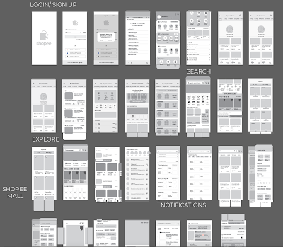
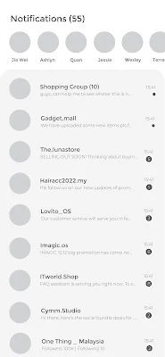
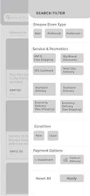
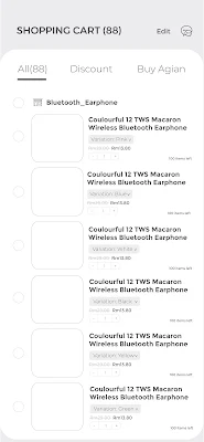
Once the UX design process is completed, students can now create a low fidelity prototype of the app. Students needs to arrange all the screen wireframes, actions, visual feedback and link them up in Adobe XD/ Framer/ Invision Studio or any other prototype software’s. Students are then required to perform usability testing whereby they will invite guests to test out their low fidelity prototype and gather all the information, response, feedback, pain points observed from the test. Students need to document this process with video and produce a document containing detail analysis of this task and the solutions to the problems faced by the testers.
Project Files (Adobe XD or Invision Studio)
2 Video Walkthrough
3 Online posts in your E-portfolio as your reflective studies
Technical And Digital Media Competencies – Demonstrate creative use of software, and effective use of digital media skills to promote or communicate design concepts or solutions (MLO 2)
User Testing Process
Introduction & Overview
Before I began, I introduced myself to the participant and explained my plan of action. To avoid giving them too many instructions at once that would overwhelm and confuse them, the scenarios were read out one after the other, after they finished each one. After giving each instruction, I just let the participants play about and make their own interpretations of the scenarios. The whole process will be in a very easy-going mode that I hope the participants can be in a very comfortable mode of viewing the Lo-Fi Prototype and to give the most honest feedback and point of view.
The Script:
"Hello, my name is Melanie (Er Xin Ru), and today I'll be conducting an anonymous user test for a prototype redesign of the Shopee - (E-Commerce Apps) app. You'll have to test exploring and using the app on your own depending on the three examples I'll give you. Please keep in mind that many other features and functions have not yet been fully integrated as this is still a low fidelity (Lo-Fi) prototype. In conclusion, please take your time browsing and provide as much honest and truthful comments as you can." Thankyou.
Lo-Fi User Testing
For user testing phase, I've prepared instructions and some questions for 3 of the interviewee which is
User #1 Zhen Quan - Working as an Graphic Designer (Video method - Zoom)
User #2 Jonathan Er - Student in Data Science (Video method- Zoom)
User #3 Shin Er - Student in UX/UI Design (Video method-Zoom)
based on the Lo-fi prototype for Shopee apps
Questions Prepared
1. From scale of 1 to 10, how would you rate the new Shopee app created?
2. How was the navigation and interface of the Shopee apps?
3. Are you satisfied with the overall interface?
4. Is there anything that you think was missing or to improve on?
- USER TESTING VIDEO (UPLOADING IN PROGRESS)
Lo-Fi User Testing Feedback
After the user testing session, I've gathered the feedback that I received.
User #1 (Zhen Quan)
1. From scale of 1 to 10, how would you rate the new Shopee app created?
2. How was the navigation and interface of the Shopee apps?
3. Are you satisfied with the overall interface?
4. Is there anything that you think was missing or to improve on?
User #2 (Jonathan Er)
1. From scale of 1 to 10, how would you rate the new Shopee app created?
2. How was the navigation and interface of the Shopee apps?
3. Are you satisfied with the overall interface?
4. Is there anything that you think was missing or to improve on?
User #3 (Shin Er)
1. From scale of 1 to 10, how would you rate the new Shopee app created?
2. How was the navigation and interface of the Shopee apps?
3. Are you satisfied with the overall interface?
4. Is there anything that you think was missing or to improve on?
Here is the feedback I collected and will have changes following what the interviewee suggested and required to make the improvement.
Lo-Fi User Testing Google Drive Link:
https://drive.google.com/drive/folders/16rPywR9dp0qKbPcCpFeUU7s_BvSbDOTe?usp=sharing
Results
Improvements to be made
Final Lo-Fi Prototype Adobe XD Submission link:
https://xd.adobe.com/view/e0728bb7-1206-46d0-a96b-2d64f2483234-b521/?fullscreen&hints=off
Final Hi-Fi Prototype Adobe XD Submission link:
https://xd.adobe.com/view/461eb411-4926-43ef-ac6f-c5759649a6fd-134d/?fullscreen&hints=off
Miro link


Comments
Post a Comment