INFORMATION DESIGN | EXERCISES 20%
INFORMATION DESIGN | EXERCISES 20%
9.1.2023 - 24.2.2022 (Week 1 - Week 7)
Er Xin Ru (Melanie) | 0354939
Bachelor Of Design (Hons) In Creative Media | Taylor's University
Subject: GCD 60504 - Information Design
INSTRUCTIONS
Week 1 -11/1/2023 | Module Briefing
This module will provide students with the fundamental principles of visual design to assist them to effectively organize, interpret, visualize and execute an appropriate range of visual solutions. These principles form the underpinnings for all visual work both in the programme and in professional practice. Good designers are good communicators. There will be discussions and critiques to help clarify ideas, gain from other viewpoints, learn to articulate/defend ideas, and express
viewpoints.
viewpoints.
Week 2 - 20/1/2023 | Saul Wurman’s L.A.T.C.H
Week 2 - Group Task (20/1/2023)
Different types of infographics & online tools
Discuss as a group each of the situations in which L.A.T.C.H. is used and summarize them on a slide for each item.
Week 2 - Exercise 2: L.A.T.C.H
Assignment Outline
Organize a group of information into a visual poster that combined and utilizes the LATCH principles (min. 4)
These are a few of the suggested compiled data you can use or, you can pick any topic you want:
Pokedex: https://pokemondb.net/pokedex/
FFXIV Bestiary: https://ffxiv.gamerescape.com/wiki/Category:Bestiary
Dinosaurs: https://www.mainstreetsmiles.com/fun-stuff/teeth-25-dinosaurs-prehistoric-creatures/
Requirements
Size resolution: 1240 × 1750 pixels or 2048 × 2048 pixels
Use a digital photo editing / illustration software available to assemble the pokemons into a LATCH infographic poster. You can re-use back the images of the monsters, but do create the rest of your own visuals to complete the poster.
Pokedex


Final Outcome PDF
L.A.T.C.H is a method of information organization that consist of these principles:

Reference:
https://parsonsdesign4.wordpress.com/resources/latch-methods-of-organization/
https://medium.com/@niveditachandra/latch-information-architecture-from-the-eyes-of-an-urban-indian-user-efd474a7bb37
https://www.upwork.com/hiring/for-clients/organizing-information-the-latch-technique/
Week 3 - 27/1/2023 | Miller’s Law "Chunking"
2. Interactivity is Key: allows for investigation and learning through discovery
3. Cite Your Source: always disclose where your data originated
4. The Power of Narrative: Humans love stories
5. Do Not Glorify Aesthetics: “should always be a consequence and never a goal”
6. Look for Relevancy: why are you visualizing the information?
7. Embrace Time: Time is difficult to work with but rich
8. Aspire for Knowledge: “A core ability of Information Visualization is to translate information into knowledge. It’s also to facilitate understanding and aid cognition.”
9. Avoid Gratuitous Visualizations: “should respond as a cognitive filter, an empowered lens of insight, and should never add more noise to the flow”
Reference: http://www.visualcomplexity.com/vc/blog/?p=644
Week 1 - 13/1/2023 | Task 1: Group Task
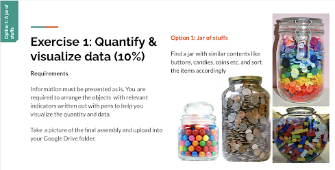
Find a jar with similar contents like buttons, candies, coins etc., and sort the items accordingly.
My Material of Choice - Malaysia CoinsI've a lot coins so i decided to use coins for the assignment
- Location
- Alphabet
- Time
- Category
- Hierarchy
Fig 1 - L.A.T.C.H
https://parsonsdesign4.wordpress.com/resources/latch-methods-of-organization/
https://medium.com/@niveditachandra/latch-information-architecture-from-the-eyes-of-an-urban-indian-user-efd474a7bb37
https://www.upwork.com/hiring/for-clients/organizing-information-the-latch-technique/
Week 3 - 27/1/2023 | Miller’s Law "Chunking"
Miller’s law, chunking, and the capacity of working memory
In 1956, George Miller asserted that the span of immediate memory and absolute judgment were both limited to around 7 pieces of information. The human brain can only remember a limited number of things instantly.
Chunking, or clustering, is the function of grouping information together related by perceptual features. This is a form of semantic relation, such as types of fruit, parts of speech, or 1980s fashion. Chunking allows the brain to increase the channel capacity of the short-term memory; however, each chunk must be meaningful to the individual.
For these reasons, categorizing many things into 5~9 chunks will allow you to remember more information than if you remember them randomly. This can be applied to the field of design.


The figures above are examples of how a number with many digits can be divided into several chunks to make it easier to remember.
Week 4 - 3/2/2023 | Manuel Lima’s 9 Directives Manifesto
In 1956, George Miller asserted that the span of immediate memory and absolute judgment were both limited to around 7 pieces of information. The human brain can only remember a limited number of things instantly.
Chunking, or clustering, is the function of grouping information together related by perceptual features. This is a form of semantic relation, such as types of fruit, parts of speech, or 1980s fashion. Chunking allows the brain to increase the channel capacity of the short-term memory; however, each chunk must be meaningful to the individual.
For these reasons, categorizing many things into 5~9 chunks will allow you to remember more information than if you remember them randomly. This can be applied to the field of design.
Fig 2 - Phone Number
Fig 3 - 4 Digit Number x16
The figures above are examples of how a number with many digits can be divided into several chunks to make it easier to remember.
Week 4 - 3/2/2023 | Manuel Lima’s 9 Directives Manifesto
Manuel Lima’s 9 Directives Manifesto
Information visualization is a process that transforms abstract data into visual representations of semantics that attempt to communicate complex ideas clearly, while allowing the user to query the data in real time.
Manuel Lima’s Information Visualization Manifesto, as published on the blog VisualComplexity.com, provides a working list that can help provide clarity on what Information Visualization through 9 directives, why information visualization differs from information art or infographics.
1. Form Follows Function: “the purpose should always be centered on the explanation, which in turn leads to insight.” Start with a Question: Your work should always be driven by a query
2. Interactivity is Key: allows for investigation and learning through discovery
3. Cite Your Source: always disclose where your data originated
4. The Power of Narrative: Humans love stories
5. Do Not Glorify Aesthetics: “should always be a consequence and never a goal”
6. Look for Relevancy: why are you visualizing the information?
7. Embrace Time: Time is difficult to work with but rich
8. Aspire for Knowledge: “A core ability of Information Visualization is to translate information into knowledge. It’s also to facilitate understanding and aid cognition.”
9. Avoid Gratuitous Visualizations: “should respond as a cognitive filter, an empowered lens of insight, and should never add more noise to the flow”
Reference: http://www.visualcomplexity.com/vc/blog/?p=644
Week 1 - 13/1/2023 | Task 1: Group Task
Different types of infographics & online tools
By now you must have realized that there are many types of infographic to cater all sorts of information. As a designer, it is crucial for you to find the right style to engage and communicate information quickly and clearly.
In a group, find out what are the different types of infographic + the kind of information they’re applicable for + an example for each identified type.
Our group selected the following 10 representative infographics from further research.
Type List
List infographics
Statistical infographics
How-to infographics
Timeline infographics
Comparison infographics
Map and location infographics
Flowchart infographics
Process description infographics
Mixed chart
Hierarchical infographic
Week 1 - Exercise 1: Quantify & Visualize data
Assignment Outline
In this assignment, quantify (count) students' own selections and arrange them in an easy-to-read layout or chart.
By now you must have realized that there are many types of infographic to cater all sorts of information. As a designer, it is crucial for you to find the right style to engage and communicate information quickly and clearly.
In a group, find out what are the different types of infographic + the kind of information they’re applicable for + an example for each identified type.
Our group selected the following 10 representative infographics from further research.
Type List
List infographics
Statistical infographics
How-to infographics
Timeline infographics
Comparison infographics
Map and location infographics
Flowchart infographics
Process description infographics
Mixed chart
Hierarchical infographic
Fig 1 - Different types of infographics & online tools Presentation Slides
13/1/2023
Assignment Outline
In this assignment, quantify (count) students' own selections and arrange them in an easy-to-read layout or chart.

Fig 2 - Exercise 1 Brief
Find a jar with similar contents like buttons, candies, coins etc., and sort the items accordingly.
My Material of Choice - Malaysia Coins
My Jar of Coins

I first sorted the coins by pattern and number which is the New version and Old version of sen and to see how many of each coin there were.


Here are the Final Version as I did arrange them well and neatly which to organise them in order such as
the New version and the Old version, I did some design like a "wifi symbol" and everything is clearly and organise well.

Fig 3 - Coins ( Oldest, Old and New version of coins)

Fig 4 - Coins Arrange well, pattern and size (Oldest, Old and New version of coins)
I arrange it neatly and separate the New version, Old version and the Oldest version which to separate and count them with total and also about of the coins/sen.

Fig 5 - Final design with Coins Arrange well, pattern and size
(Oldest, Old and New version of coins)
the New version and the Old version, I did some design like a "wifi symbol" and everything is clearly and organise well.
Week 2 - Group Task (20/1/2023)
Different types of infographics & online tools
Discuss as a group each of the situations in which L.A.T.C.H. is used and summarize them on a slide for each item.
Fig 3 - L.A.T.C.H Presentation Slides 20/1/2023
Assignment Outline
Organize a group of information into a visual poster that combined and utilizes the LATCH principles (min. 4)
These are a few of the suggested compiled data you can use or, you can pick any topic you want:
Pokedex: https://pokemondb.net/pokedex/
FFXIV Bestiary: https://ffxiv.gamerescape.com/wiki/Category:Bestiary
Dinosaurs: https://www.mainstreetsmiles.com/fun-stuff/teeth-25-dinosaurs-prehistoric-creatures/
Requirements
Size resolution: 1240 × 1750 pixels or 2048 × 2048 pixels
Use a digital photo editing / illustration software available to assemble the pokemons into a LATCH infographic poster. You can re-use back the images of the monsters, but do create the rest of your own visuals to complete the poster.
Pokedex
I chose Pokédex as my theme. The reason is as follows: the characteristics of the Pokémon fit into the five principles of L.A.T.C.H and seem to be the best way to demonstrate them.
- Locations - Habitat Map - Habitat varies from Pokémon to Pokémon.
- Alphabet - Name of Pokémon
- Time - Evolution of Pokémon as they grow - As they grow, Pokémon evolve and change their appearance.
- Category - Type of Pokémon
- Hierarchy - The compatibility of types (for Pokémon Battle) - In Pokémon battles, damage increases or decreases depending on the compatibility between the type of attacking move and the opponent's type.
Process in Adobe Illustrator

Fig 4 - Progress of L.A.T.C.H Poster

Fig 5 - Progress of L.A.T.C.H Poster

Fig 6 - Progress of L.A.T.C.H Poster

Fig 7 - Progress of L.A.T.C.H Poster
Final Outcome JPEG

Fig 8 - Final JPEG of L.A.T.C.H Poster
Fig 9 - Final PDF of L.A.T.C.H Poster
Week 3 - 27/1/2023 | Group Task
Week 4 - 3/2/2023 | Group Task
In your group, present an explanation on the topic and provide an example of how to best utilize this technique in terms of visual delivery for each of these approaches:
1- A well-designed infographic
2- UX/UI, web, app, games (screen-based basically)
3- Processes
1- A well-designed infographic
2- UX/UI, web, app, games (screen-based basically)
3- Processes
Week 4 - 3/2/2023 | Group Task
Manuel Lima’s 9 Directives Manifesto
In your group, present an explanation on this topic and find one example of how to best display and utilize design for each of the directives.
As conclusion, do also present one good designed infographic that best illustrate of the 9 directives for information visualizations and one poorly designed infographics that failed to address the directives.


Comments
Post a Comment