DST 61004 APPLICATION DESIGN II - FINAL COMPILATION TASK 1-3 E-PORTFOLIO


22.4.2024 - 26.7.2024 (Week 1 - Week 7)
Er Xin Ru (Melanie) | 0354939
Bachelor Of Design (Hons) In Creative Media | Taylor's University
Subject: DST61004 - Application Design II
Final Compilation - Task 1-3 E-Portfolio

INSTRUCTIONS 


Total of 4 Blogs - Task 1, Task 2, Task 3 and Final Compilation

Task 1: App Design II Self-Evaluation and Reflection

Task 2: App Design II Interaction Design Planning & Prototyping
https://melanieerdesigner.blogspot.com/2024/06/dst-61004-application-design-ii-task-2.html

Task 3: App Design II Interactive component Design & Development & Final Completed Apps

Task 1: App Design 1 Self-Evaluation and Reflection
In our Application Design 1 course, we were tasked with writing a blog post that involved a thorough self-evaluation and reflection on the final project we completed. This exercise was designed to help us document and analyze the issues, challenges, and difficulties we encountered during the mobile app design process, and to propose solutions for improving the app’s aesthetic and user flow.

Mobile app design is inherently iterative, requiring continuous refinement and enhancement. This reflective task aimed to aware of the ongoing nature of improvements in app design, emphasizing that perfection is a moving target and that user feedback and self-assessment are critical to this process. To facilitate constructive feedback, we were required to submit their self-evaluation and reflection documentation via Google Docs. This platform was chosen for its ease of commenting, allowing the module coordinator to provide detailed feedback directly within the document.

Previously, there were a total of 4 tasks for my Application Design 1 module course. Here is a review of my blog post on Application Design 1.

E-Portfolio Links: Application Design 1
1. TASK 1 - APPLICATION DESIGN I: PROJECT 1 | Task 1 - (20%) App Design Proposal

2. TASK 2 - APPLICATION DESIGN I: PROJECT 2 (UX/UI DOCUMENTS) | Project 2: UI/UX Design Document 20 %

3. TASK 3 - APPLICATION DESIGN I: PROJECT 3 (LO-FI) | Project 3: Lo-Fi App Design Prototype 20%

4. TASK 4 - APPLICATION DESIGN I: PROJECT 4 (HI-FI) FINAL PROJECT | Final Project & E-portfolio 40%


TASK 1 : SELF-EVALUATION AND REFLECTION

https://melanieerdesigner.blogspot.com/2024/05/dst-61004-application-design-ii.html

1 | (HI-FI) High-fidelity prototype from APPLICATION DESIGN 1
The flow of my apps - Process in AI & Adobe XD
In Application Design 1, we were required to share a post on our blog about self-evaluation and reflection on the app design we created.

Here is my Hi-Fi (High-Fidelity) prototype from App Design 1:
For this project, Creating this Hi-Fi prototype was a learning experience that taught me a lot about user-centered design and the importance of visual clarity in App development. This is just a preview of the full design work I did for the prototype, and updates will be made in the next sections.

Fig 1. Design in AI Illustrators before making it at Adobe XD 

Fig 2. Design in AI Illustrators before making it at Adobe XD 

Before starting the prototype, I conducted extensive research and exploration since it was my first time using Adobe XD. Although I found it challenging but I was determined to do my best. After that, I exported the project to Adobe XD and after several hours of dedicated effort, I completed the prototype.

Fig 1. Making it at Adobe XD of my Shopee Apps and how it flows


2 | COMPARISON OLD & NEW DESIGN - REDESIGN & UPDATES

Here are the details of each Hi-Fi app page, organized into sections with comparisons between the old and new designs.

  1. Log In/ Register page 
  2. HomePage - Daily Discover
  3. My Profile
  4. Search Filter
  5. My Purchase
  6. Discover : Live/Findings
  7. Shopee Mall 
  8. Message and Notifications
  9. Type to Search Here - Trending Search
  10. My Wallet
  11. Product page : Description and Variation
  12. Checkout & Payment
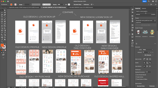
Adobe Illustrator - NEW DESIGN
Here are New Design for Application Design II

Fig 1. Adobe Illustrator - New Design

Fig 2. Adobe Illustrator - New Design

ADOBE ILLUSTRATOR - OLD & NEW DESIGN COMPARISON
  1. Log In/ Register page 
  2. HomePage - Daily Discover
  3. My Profile
  4. Search Filter
  5. My Purchase
  6. Discover : Live/Findings
  7. Shopee Mall 
  8. Message and Notifications
  9. Type to Search Here - Trending Search
  10. My Wallet
  11. Product page : Description and Variation
  12. Checkout & Payment
Fig 1. Adobe Illustrator - Old and New Design Comparison

Fig 2. Adobe Illustrator - Old and New Design Comparison

Fig 3. Adobe Illustrator - Old and New Design Comparison

Fig 3. Adobe Illustrator - Old and New Design Comparison


1. 
Log In/ Register page [ Comparison Old & New Design ]

Old Design
 
Fig 1. Log In / Register [ Old Design ] 


Fig 2. Log In / Register [ Old Design ] 


New Design


Fig 1. Log In / Register [ New Design ] 

Fig 2. Log In / Register [ New Design ] 

Here is a comparison of the old and new designs. Most of it will remain the same, I believe it was a good decision to only make updates to the choose an account section after clicking on it, in order to enhance and make it look more professional.

2. 
Homepage - Daily Discover [ Comparison Old & New Design ]
The design are mostly remaining but I want to create a simpler, more stylish appearance that conveys a clean and minimalist design feel. The original design felt the details are not satisfied as u can see (type to search here are too big) and some of the picture and words are not align perfectly which could be not satisfied for users. so I decided to redesign it with several key improvements:

Old Design
Fig 1. Main Page [ Old Design ] 

New Design


Fig 1. Main Page [ New Design ] 

There are several changes have been made for the New Design :
  • Scroll View 
  • Type to Search Here Bar: Minimise it more smaller to have a greater world, include the search and camera icons, as well as shopping cart and message icons.
  • My Wallet Bar: I've add the My Wallet bar with the following: Scanning option | Wallet balance | Total Shopee coins |Vouchers/discounts
  • Mistake (there are blank part in you might like section)
  • Shocking Sales SectionAdd colour icons above the section & Color the icons to make it easier for consumers to identify, as too many options can be messy.
  • Shortcuts: Add shortcuts for Discounts, Shopee Food Near Me, and Daily Discover.
  • Product Display: Ensure product pictures catch consumer attention by highlighting features such as Free Returns and discounts.
3. 
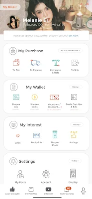
My Profile [ Comparison Old & New Design ]
Here's the profile page. The old design was outdated and didn't look very professional, so I took the opportunity to make it simpler and more modern. I aimed to create an engaging and visually appealing design for users. My goal was to improve the user experience by adding elements that are attractive and easy to use while keeping the unique style that makes it recognizable as a Shopee app.

Old Design
                          
Fig 1. Profile [ Old Design ] 

New Design

Fig 2. Profile [ New Design ] 

There are several changes have been made for the New Design :
  • Scroll View
  • Most of the design structure has been changed, including adjustments to the profile picture and cover. 
  • The design is now simpler and makes it easier for consumers to quickly find what they are looking for.

4. 
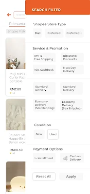
Search Filter [ Comparison Old & New Design ]
The profile page's new design structure retains similarities to the old design, with several key enhancements for improved usability and visual clarity. The updated colour scheme now look more contrast using of orange and light grey below of words, making the interface clearer and easier to navigate. 

Old Design

Fig 1. Search Filter [ Old Design ] 

New Design

Fig 2. Search Filter [New Design ] 
    There are several changes have been made for the New Design :
    • Improved Color Scheme: The updated colour scheme now has a more contrasting look, using orange and light grey below the text. This makes the interface clearer and easier to navigate, enhancing readability and reducing eye strain. By refining the color scheme and improving visual clarity, the profile page now offers a more user-friendly experience. These enhancements make it easier for users to navigate the app accurately and efficiently, addressing common issues related to misclicks and readability.
    5. 
    My Purchase [ Comparison Old & New Design ]
    Compared to the old design, I maintained most of the original elements but made significant improvements to upgrade and enhance the pages.

    Old Design
    Fig 1. My Purchase [ Old Design ] 

    New Design


    Fig 2. My Purchase [ New Design ] 

    There are several changes have been made for the New Design :
    • No Order Yet: Displayed with a light orange colour tone for a more pleasant look.
    • You Might Like: Includes information on free returns and discounts shown on the profile.
    6. 
    Discover : Live/Findings [ Comparison Old & New Design ]

    Old Design

    Fig 1. Explore: Live/Findings [ Old Design ] 

    New Design


    Fig 2. Explore: Live/Findings [ New Design ] 

    There are several changes have been made for the New Design :
    • Live Profile: Added to enhance interactions and provide shortcuts for users. An orange round shape is displayed next to the live shop profile to indicate that it is active.
    • Findings: Includes added features such as discounts, free gifts, and buy1free1 offers.

    7. 
    Shopee Mall [ Comparison Old & New Design ]
    The design are mostly remaining but I want to create a more functional compare to the old design. The original design felt the details are not satisfied as u can see (search : shopee mall) and some of the picture and words are not align perfectly and spaces as well which could be not satisfied for users. so I decided to redesign it with several key improvements:

    Old Design
                                    
    Fig 1. Shopee Mall [ Old Design ]
    New Design


    Fig 2. Shopee Mall [ New Design ] 

    There are several changes have been made for the New Design :
    • Scroll View 
    • Type to Search Here Bar: Minimise it more smaller to have a greater world, include the search and camera icons, as well as shopping cart and message icons.
    • Discount % word been display on the product profile
    8. 
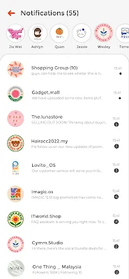
    Message and Notifications [ Remain Design ]
    The design remaining as the old one as I think it is good to go. But for the animating coding ideas I've think more interactive elements compared to the old one, enhancing user engagement and functionality. 

    Remain Design

    Fig 1. Message & Notifications [ Remain Design ] 
    • Interactive Chat Icons: The design includes interactive icons that enhance the user experience. For example, icons for favorite shops or frequently messaged sellers appear, making it easy for users to revisit these stores or continue conversations.
    • Quick Access Features: Icons for frequently visited shops and recent messages provide users with quick access to their preferred stores or ongoing conversations with a simple click.
    9. 
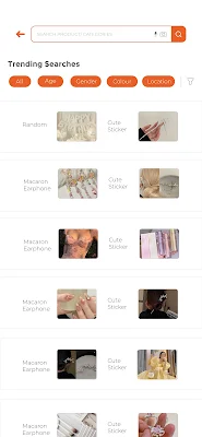
    Type to Search Here - Trending Search [ Comparison Old & New Design ]
    I've made significant improvements to the search product/categories feature compared to the old design. The new look is simpler, with more contrasting colors that make it easy to view at first glance, and the design is more straightforward than before.

    Old Design


    Fig 1. Search Product/Categories [ Old Design ] 
    New Design

    Fig 2. Search Product/Categories [ New Design ] 

    There are several changes have been made for the New Design :
    • Scroll View
    • Features a more simplified design for searching product categories.
    • Border: The lighter of the outer glow effect has been simplified for a cleaner look.

    10.
    My Wallet [ Comparison Old & New Design ]
    The My Wallet section provides users with a comprehensive overview of their financial interactions within the app. It includes:
    • Scanning Option: Allows users to easily scan QR codes for payments or promotions.
    • Wallet Balance: Displays the current balance available in the user's wallet.
    • Total Shopee Coins: Shows the total number of Shopee coins the user has accumulated.
    • Vouchers/Discounts: Lists available vouchers and discounts that users can apply to their purchases.
    Old Design

    Fig 1. My Wallet [ Old Design ] 

    New Design


    Fig 2. My Wallet [ New Design ] 

    There are several changes have been made for the New Design :
      My Wallet: The My Wallet section provides users with a comprehensive overview of their financial interactions within the app. It includes:
      • Shopee Pay: Displays the balance amount prominently on the page, making it look more professional and easy for users to use for payments. This improvement addresses the previous issue where users were confused because they couldn't see their balance.
      • Shopee Coins: Shows the total number of Shopee coins collected, enhancing the professional look and making it easier for users to use coins for payments. This change resolves the previous confusion where users couldn't see their coin balance.
      • Vouchers: Mostly remains the same, but now includes a bar below the Shopee Pay, Shopee Coins, Vouchers, and Deals sections. This bar categorizes vouchers into sections like Shopee, ShopeeFood, shops, and more, improving organization and usability.
      This section is designed to streamline financial management and make it convenient for users to track their balance, rewards, and savings in one place.

      11. 
      Product Page - Description & Variation [ Comparison Old & New Design ]
      Product Page: The product page is significantly more detailed and uses a more contrasting colour scheme compared to the old design.

      Old Design
                                  

      Fig 1. Product/Service Page [ Old Design ] 

      New Design


      Fig 2. Product/Service Page [ New Design ] 

      Product Details: Provides comprehensive information about the product.
      Product Variation: Allows users to choose the product colour and amount.
      Add to Cart: Features a streamlined shopping cart addition process.

      Most of the design remains the same, but there are updates primarily to the color scheme. Since there are too many details on the page, I've aimed to make it cleaner and simpler. The overall structure is the same, with only slight changes for improved clarity.

      12.
      Checkout & Payment [ Comparison Old & New Design ]

      Checkout and Payment Process: The checkout and payment process has been significantly improved in the new design, with everything aligned neatly compared to the old design. Some important parts have been highlighted, such as:

      Old Design

      Fig 1. Checkout & Payment [ Old Design ] 

      New Design

      Fig 2. Checkout & Payment [ New Design ] 

      Total Amount: The price of the product is prominently displayed.
      Select Payment Method: This section is made clearer for user convenience.

      Other elements have been retained as they were already effective.

      The new design features a streamlined checkout flow with clear progress indicators, enhanced security measures, and multiple payment options for user convenience.


      3 | VIDEO PRESENTATION - Comparison New & Old Design :

      Youtube Task 1 Vid Presentation : Comparison New & Old Design

      3 | NEW DESIGN VIEW
      Here are the details of each Hi-Fi app page, organized into sections with comparisons between the old and new designs.

      1. Log In/ Register page 
      2. HomePage - Daily Discover
      3. My Profile
      4. Search Filter
      5. My Purchase
      6. Discover : Live/Findings
      7. Shopee Mall 
      8. Message and Notifications
      9. Type to Search Here - Trending Search
      10. My Wallet
      11. Product page : Description and Variation
      12. Checkout & Payment


      4 | MY NEW FLOW - ADOBE XD


      I exported the design I upgraded in Adobe Illustrator and started my flow in Adobe XD. I learned by watching tutorials to further improve and create new flows compared to the previous version. The old design was too simple, so I wanted to challenge myself to make it better.

      Fig 1. Design export to Adobe XD View

      Fig 2. Design export to Adobe XD Zoom View

      Fig 3. Design export to Adobe XD Prototype View

      Fig 4. Design export to Adobe XD Prototype Zoom View

      4 | VIDEO PRESENTATION - ADOBE XD MY FLOW :

      Fig 1. Video Presentation View for my Adobe XD Flow View


      Vid 1. Video Presentation View for my Adobe XD Flow View


      5 | VIDEO PRESENTATION HI-FI prototype - ADOBE XD TESTING

      Prototype Record from Adobe XD [No Presenting, Just View & Testing for Flow]


      YouTube Video : Adobe XD Testing [No Presenting, Just View & Testing for Flow]

      6 | ADOBE XD MY FLOW - PROTOTYPE VIEW :
      Adobe XD View Prototype

      TASK 2: App Design II Interaction Design Planning & Prototyping


      2 | TASK 2: INTERACTION DESIGN PLANNING AND PROTOTYPING
      [FIGMA JAM - Micro Animation & Interaction]

      Figma Progression : Design Planning & Prototyping 

      For Task 2, I had to make a prototype based on the redesigned design from Task 1 and plan a complete interactive animation to be used in the app using Figma Jam. I will be creating the visual parts and making sure all the user interactions and transitions worked smoothly.

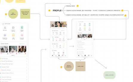
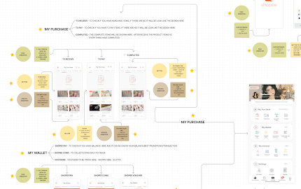
      First, I imported all the design pages that I needed for the animation into Figma Jam. This was important because it allowed me to have all the visuals and layouts in one place, which made it easier to organize everything. Each page showed a different screen of the apps, and having them all together helped me see the whole user experience. Next, I started connecting the pages. I used arrow lines to show the pathways and transitions a user would follow while using the app. These connections weren't random; they were carefully thought out to match the logical flow we planned during the redesign.

      For each connection, I added some notes to explain what parts would be animated on each page. These notes included details like which buttons or icons would trigger animations, what kind of animation it would be (like fade-in, fade-out, Specific Animation, Buttons and Page Animation & etc), and how long each animation would last. This step was important to give a clear guide for me to put in for coding in Adobe Dreamweaver, making sure the interactive elements will be matching as for the final outcome.

      So, developing the prototype and planning the interactive animation in Figma Jam involved importing all the necessary pages, connecting them with arrow lines, and adding detailed notes about the animations. This careful planning aimed to create a smooth and engaging user experience, combining the visual design with interactive elements seamlessly.

      Fig. 1 Figma Progression : Design Planning & Prototyping 

      Fig. 2 Figma Progression : Design Planning & Prototyping 

      Figma link: https://www.figma.com/board/aM74IJooaxrJEvJ9QGdnan/Task-2%3A-INTERACTION-DESIGN-PLANNING-AND-PROTOTYPING?node-id=0-1&t=HJjgdeDGYcHjNxrX-0

      Here are my outcome and u can view here [FIGMA JAM] :

      Explanation for each page that shares different animations by Picture & Video Method:

      Log In/ Register page
      Button | Page Animation | Specific Animation

      Fig 1. Log In / Register page 

      Video 1. Log In / Register page 

      My Profile
      Button | Page Animation | Specific Animation

      Fig 1. My Profile

      Video 1. My Profile

      Homepage - Daily Discover
      Button | Page Animation | Specific Animation

      Fig 1. Homepage - Daily Discover

      Video 1. Homepage - Daily Discover

      My Wallet
      Button | Page Animation | Specific Animation

      Fig 1. My Wallet

      Video 1. My Wallet

      My Purchase
      Button | Page Animation | Specific Animation

      Fig 1. My Purchase

      Video 1. My Purchase

      Discover : Live/Findings
      Button | Page Animation | Specific Animation

      Fig 1. Discover : Live/Findings

      Video 1. Discover : Live/Findings

      Shopee Mall 
      Button | Page Animation | Specific Animation

      Fig 1. Shopee Mall 

      Video 1. Shopee Mall

      Message and Notifications
      Button | Page Animation | Specific Animation

      Fig 1. Message and Notifications

      Video 1. Message and Notifications

      Type to Search Here - Trending Search
      Button | Page Animation | Specific Animation

      Fig 1. Type to Search Here - Trending Search

      Video 1. Type to Search Here - Trending Search

      Product page : Product Description and Variation
      Button | Page Animation | Specific Animation

      Fig 1. Product page : Product Description and Variation

      Video 1. Product page : Product Description and Variation

      Search Filter
      Button | Page Animation | Specific Animation

      Fig 1. Search Filter

      Video 1. Search Filter

      Checkout & Payment
      Button | Page Animation | Specific Animation
      Fig 1. Checkout & Payment

      Video 1. Checkout & Payment


      3 | VIDEO PRESENTATION - 

      INTERACTION DESIGN PLANNING AND PROTOTYPING IN FIGMA JAM
      [Micro Animation & Interaction]


      Interaction Design Planning & Prototyping 
      in Figma Jam - [Micro Animation & Interaction]

      Figma Jam Link :


      Task 3: App Design II Interactive component Design & Development & Final 

      Completed Apps

      CODING IN DREAMWEAVER (VIEW FOR CODING) & GOOGLE CHROME VIEW OF THE APPS

      Here are the details of every Part, Flow/Animations with Coding for my Shopee Apps. It will be in video for every of the Coding parts to be shown in Dreamwaver and Google Chrome View and record the part in Video as my Final Video Presentation Part by Part will be more clearer. There are also Final Presentation (All parts combination + Present using Google Chrome + Netlify)

      1. Log In/ Register page 
      2. My Profile
      3. My Purchase
      4. My Wallet
      5. Homepage - Daily Discover
      6. Shopee Mall 
      7. Discover : Live/Findings
      8. Shopee Mall 
      9. Message and Notifications
      10. Type to Search Here - Trending Search - Random
      11. Relevance & Search Filter
      12. Product page : Description and Variation
      13. Checkout & Payment
      FINAL FILES SUBMISSION HERE

      1 | Log In/ Register page [X3]

      • i | Logo Page [Source Code/Basic CSS]
      • ii | Log in (Continue with Google) [Source Code/Basic CSS/Log in.CSS/ Effect JS]
      • iii | Choose Account [Source Code/Basic CSS/Google.CSS]
      i | Logo Page [Source Code/Basic CSS]

      https://youtu.be/FIrffUxCBPo
      Video Presentation - Logo Page [Source Code/Basic CSS]


      ii | Log in (Continue with Google) [Source Code/Basic CSS/Log in.CSS/ Effect JS]

      https://youtu.be/fbqSvFlBQxc
      Video Presentation - Log in (Continue with Google) 
      [Source Code/Basic CSS/Log in.CSS/ Effect JS]


      iii | Choose Account [Source Code/Basic CSS/Google.CSS] 

      Video Presentation - 
      Choose Account [Source Code/Basic CSS/Google.CSS]


      2 | My Profile : [Source Code/ Basic.CSS/Profile.CSS/Effect.JS]
      Youtube Link : https://youtu.be/EJGxmnvTSaM

      https://youtu.be/EJGxmnvTSaM
      Video Presentation - 
      [Source Code/ Basic.CSS/Profile.CSS/Effect.JS]


      3 | My Purchase [Source Code/ Basic.CSS/MyPurchase.CSS/Effect.JS]


      My Purchase included (To Pay, To Receive and Completed but it did not show the animation and able to clcik directly in Dreamweaver as it only available to see it at Safari/Google Chrome)

      Video Presentation - My Purchase 
      [Source Code/ Basic.CSS/MyPurchase.CSS/Effect.JS]


      4 | My Wallet : [Source Code/ Basic.CSS/MyPurchase.CSS/MyWallet.CSS/Effect.JS]

      Swipe right and u were able to see Shopee Pay, Shopee Coins and Vouchers 

      Youtube Link : https://youtu.be/NnW7pNVk6W0

      Video Presentation - My Wallet 
      [Source Code/ Basic.CSS/MyPurchase.CSS/MyWallet.CSS/Effect.JS]


      5 | Homepage - Daily Discover : [Source Code/ Basic.CSS/Profile.CSS/Hp.CSS/Effect.JS/Timer.JS]


      Video Presentation - Homepage | Daily Discover : 
      [Source Code/ Basic.CSS/Profile.CSS/Effect.JS]


      6 | Shopee Mall [Source Code/ Basic.CSS/Profile.CSS/Homepage.CSS/ShopeEMall.CSS/Effect.JS/Timer.JS]


      Video Presentation - Shopee Mall 
      [Source Code/ Basic.CSS/Profile.CSS/Homepage.CSS/ShopeEMall.CSS/Effect.JS/Timer.JS]


      7 | Discover : Live/Findings [Source Code/ Basic.CSS/Profile.CSS/Discover.CSS/Effect.JS]


      Video Presentation - Discover : Live/Findings 
      [Source Code/ Basic.CSS/Profile.CSS/Discover.CSS/Effect.JS]


      8 | Message and Notifications [Source Code/ Basic.CSS/Profile.CSS/Discover.CSS/Notification.CSS/Effect.JS]


      Video Presentation - Message and Notifications 
      [Source Code/ Basic.CSS/Profile.CSS/Discover.CSS/Notification.CSS/Effect.JS]


      9 | Type to Search Here - Trending Search - Random [Source Code/ Basic.CSS/Profile.CSS/Discover.CSS/Notification.CSS/Effect.JS]


      Video Presentation - Type to Search Here - Trending Search - Random 
      [Source Code/ Basic.CSS/Profile.CSS/Discover.CSS/Notification.CSS/Effect.JS]


      10 | Trending Search  [Source Code/ Basic.CSS/Profile.CSS/Discover.CSS/Search.CSS/Effect.JS]


      Video Presentation - Trending Search 
      [Source Code/ Basic.CSS/Profile.CSS/Discover.CSS/Search.CSS/Effect.JS]


      11 | Relevance + Search Filter [Source Code/ Basic.CSS/Profile.CSS/Discover.CSS/ Search.CSS/Relevance.CSS/Effect.JS] 


      Video Presentation - Relevance + Search Filter 
      [Source Code/ Basic.CSS/Profile.CSS/Discover.CSS/ Search.CSS/Relevance.CSS/Effect.JS] 


      12 | Product page : Description [Source Code/ Basic.CSS/Product.CSS]


      Video Presentation - Product page : 
      Description [Source Code/ Basic.CSS/Product.CSS]


      13 | Product Variation [Source Code/ Basic.CSS/Profile.CSS/Choose.CSS] & Shopping Cart [Source Code/ Basic.CSS/Product.CSS/Choose.CSS/Cart.CSS] 


      Netlify View : 

      Youtube Link : https://youtu.be/fY2biDnilJI

       Video Presentation - 
      Product Variation [Source Code/ Basic.CSS/Profile.CSS/Choose.CSS] 
      & Shopping Cart [Source Code/ Basic.CSS/Product.CSS/Choose.CSS/Cart.CSS] 


      14 | Checkout & Payment [Source Code/ Basic.CSS/Product.CSS/Choose.CSS/Cart.CSS/Checkour.CSS/Effect.JS]


       Video Presentation - Checkout & Payment [Source Code/ Basic.CSS/Product.CSS/Choose.CSS/Cart.CSS/Checkour.CSS/Effect.JS]

      1 | FINAL VIDEO PRESENTATION - DREAMWEAVER + GOOGLE CHROME VIEW 


      Final Video Presentation - Dreamweaver Coding + Google Chrome View


      2 | FINAL VIDEO PRESENTATION - OVERVIEW OF MY SHOPEE APSS


      Final Video Presentation - Overview of my Shopee Apps


      3 | VIDEO PRESENTATION - SHORT INTRODUCTION FOR DREAMWEAVER USE & FLOW

      Download ZIP files in Google Drive and Open in Dreamweaver
      Youtube Link : https://youtu.be/_7ueDh6tk0o

      Video Presentation - Short Introductions for Dreamweaver Use & flow


      4 | FILES SUBMISSION IN TOTAL 


      Comments